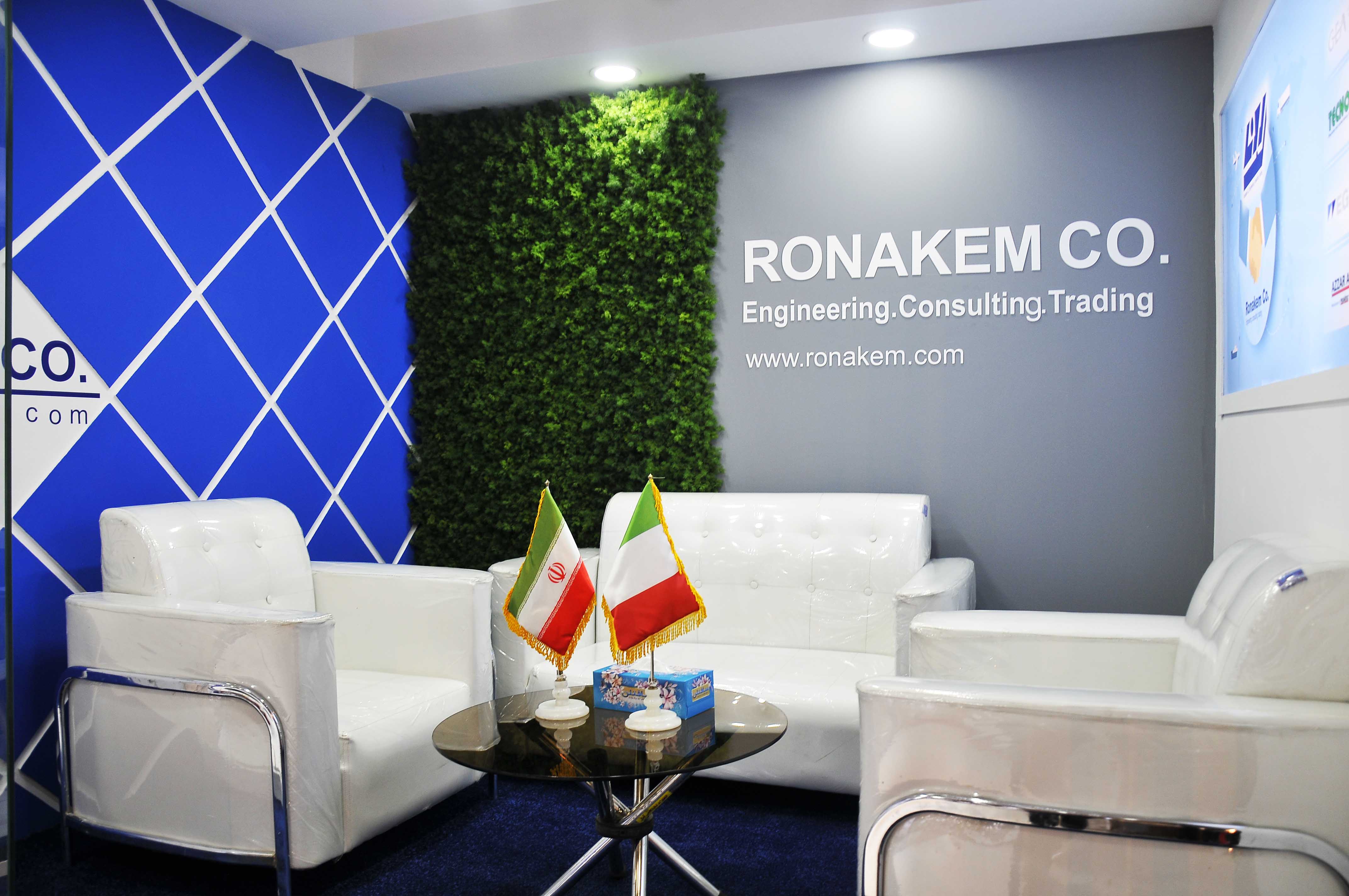
Top 5 Tips For Effective Trade Show Booth Graphics

Your trade show booth is one of the best marketing tool that deliver your company’s message. if design well, the graphics in your booth will amplify that message, leading you to a successful trade show.
here are 5 tips to consider when designing your graphics.
Tips #1: limit the amount of information to 3 basic elements.
A trade show floor is filled with the competition for attention. show attende are on information overload. make it easy for them to connect with your message by making it clear and concise.
Have your graphic communicate only three things:
- Who you are: your company name and logo
- What you do: the only thing you want people to remember
- Why they need you: communicate solutions to their problems
Tips #2: spend time developing your messaging
The “why they need you” messaging might be the most challenging to develop. spend time here because it’s potentially the most essential message you communicate. focus on your ideal customer and speak to them.
Talk to your sales staff to identify keywords that resonate with your prospects. then develop messaging that answer the question, “what’s in it for me?” leaves the details and company jargon out of your messaging and save them for the in-person dialogues. you will likely have a lot of these if you nail your message!
Tips #3: optimized the layout of the graphic
layout plays a significant role in the success of a graphic. layout refers to the arrangement of elements in a graphic, including images, text and style. this is where a graphic designer comes in. they are skilled at arranging these elements so a relationship and visual hierarchy form between them.
An optimized layout of a trade show graphic should satisfy the following:
- Message is visible from at least 10 feet away
- Messaging is not blocked by in-booth furniture or people
- Attention-grabbing, ideally emphasizing people photos over product-only photos
Tips #4: to perfect placement, put yourself to your prospect’ shoes
Depending on the size and design of your booth, you might have multiple graphics that are displayed. graphics tend to fall into the three main categories below. consider which message you want to show for reach range.
- Long-range graphics: such as a hanging sign, tower, or column graphic meant to be seen from very far away.
- Medium-range graphics: placed 10-50 feet from an aisle, these graphics are meant to be see from neighboring exhibit to lure people into your booth. ideally positioned at or above eye level.
- Short-range graphics: mounted at eye level and read from 1-10 feet away. these graphics are used to communicate a message to attendees inside your booth.
Tips #5: use typefaces to maximize the effect of your messaging
Typography is all around us. the beauty of fonts is that they can transform the written word to express an entire range of emotions. A skilled graphic designer can pair specific fonts to your message to facilitate a emotional response.
Much like using color in graphical layouts, there are rules of thumb for using fonts:
- Avoid using multiple fonts in the same graphic. ideally only use one
- Make font size 1 inch tall for every 3 feet away the attendee is standing. for example, if a graphic is mean to be read from 6 feet away, the type should be 2 inches tall.
Final world
Think about the most successful graphic you’ve ever used in a trade show booth why was it successful? did it satisfy any or all the tips mentioned in this article? please share your experiences in the comments below.
If you attended to QNCC or DECC or MTCC or any exhibition around the world please visit and check our portfolio page with our past exhibition stand design and building work in order to receive shortly a detailed proposal (stand design and quote) please send your inquiry or brief via email to:
- a.taherian@tavanmadar.com
- sales@tavanmadar.com
- info@tavanmadar.com
we will respond within 12 hours!


